
How We Built a Lung Transplant Power BI Dashboard
A transplant team should not have to search multiple systems, assemble spreadsheets, and read every chart to find the patients who need attention today.
Texas AI Consulting built a lung transplant surveillance dashboard that brings direct transplant data from TeleResults together with radiology data available through the HCA Healthcare Intelligence Net (HIN) and queried through BigQuery. The result is one governed Power BI application with an exception-based view of the post-transplant population, longitudinal lab trends, protocol status, and the information needed for a daily clinical huddle.
The overall goal was straightforward: give clinicians one place to review patient data, recognize what needs attention, and make better-informed decisions in support of better patient outcomes.
THE PROJECT IN ONE LINE
Two governed data paths became one daily-refreshed Power BI surveillance application where clinicians can review patient data in one place and act on alerts, trends, and protocols.
The Clinical Problem
Lung transplant surveillance is continuous. The team needs to know how long each patient has been post-transplant, whether immunosuppression levels are in range, how renal function is trending, whether pulmonary function has fallen from the patient's personal best, and which surveillance procedures are due.
The relevant information did not live in one place.
- TeleResults, the transplant EHR, contained structured transplant and clinic data in its SQL Server backend, but that source did not contain all of the radiology data needed for protocol measurement.
- The HCA Healthcare Intelligence Net (HIN) served as the enterprise data and analytics environment that integrates information from clinical source systems for governed reporting and decision support.
- HCA's Google Cloud Platform services and BigQuery provided the governed access and query path used to locate the required HIN radiology data.
- Written program protocols defined what should happen at each stage after transplant.
The technical challenge was not simply building a chart. It was creating a clinical decision-support workflow that connected data, program rules, and daily operations without hiding gaps in the source data.
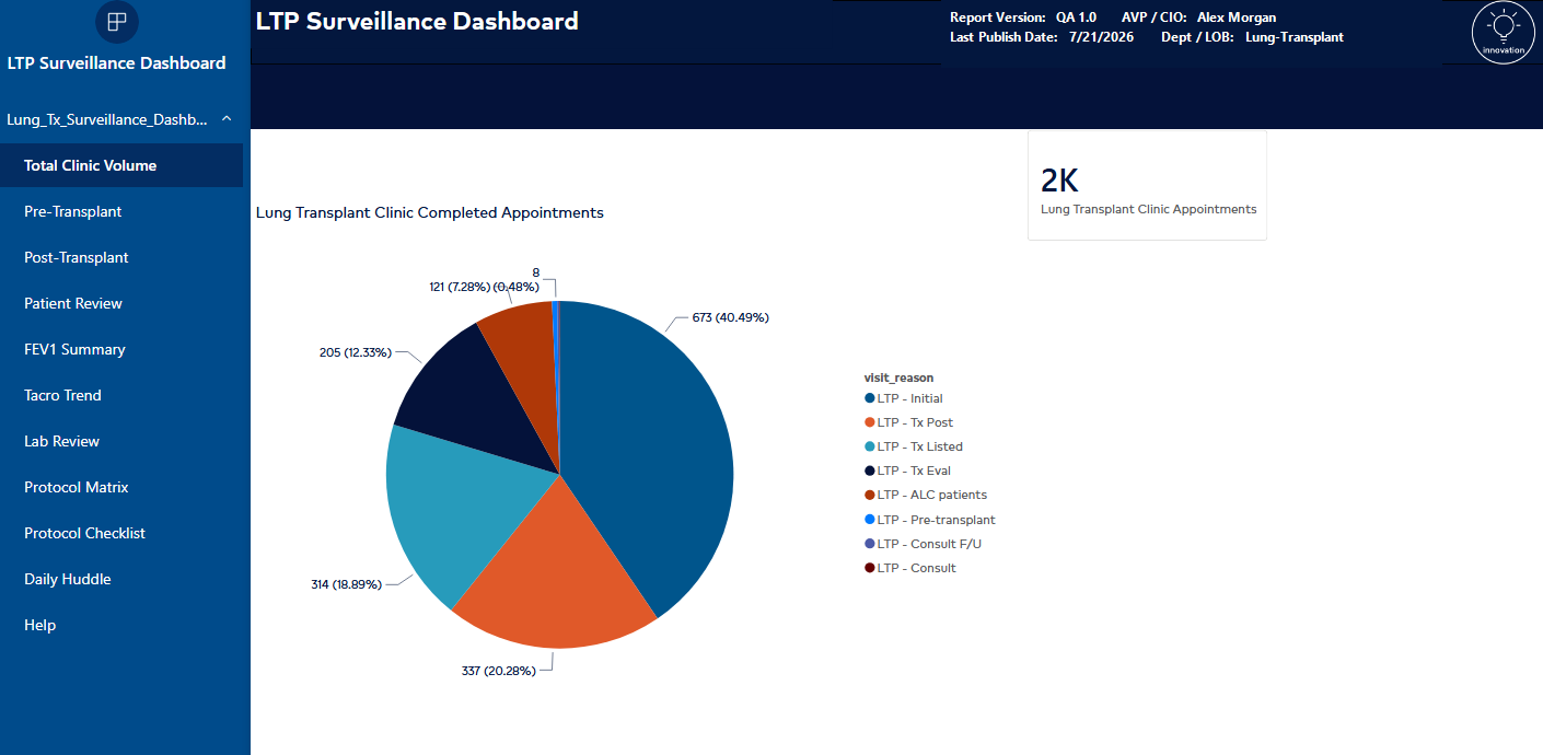
The dashboard opens with a high-level view of completed lung transplant clinic appointments before moving into patient and protocol surveillance.
Establishing the Data Architecture
The project started with source discovery and data lineage, not dashboard colors.
| Layer | Technology | Role in the solution |
|---|---|---|
| Direct transplant source | TeleResults backed by SQL Server | Direct access to transplant dates, clinic activity, labs, pulmonary function, and patient-level surveillance fields |
| Enterprise data and analytics environment | HCA Healthcare Intelligence Net (HIN) | Integrates information from clinical source systems for governed analytics, data lineage, historical reporting, and decision support |
| Cloud access and query layer | HCA Google Cloud Platform and BigQuery | Governed query path into HIN used to locate radiology and other protocol data missing from the TeleResults SQL source |
| Semantic and reporting layer | Power BI Service | Governed model, daily refresh, alerts, trends, protocol views, and clinical huddle workflow |
I started with the source closest to the transplant workflow. Using SQL Server Management Studio, I explored the TeleResults backend and traced the tables, keys, and relationships needed for the model. That direct SQL path established the transplant roster, dates, clinic activity, labs, pulmonary function, and other patient-level surveillance fields.
The discovery process also exposed an important gap: the TeleResults SQL Server did not contain the radiology data needed to measure every applicable element of the transplant protocol. Stopping at the application database would have left the dashboard incomplete.
That is where understanding HCA's broader data architecture mattered. HIN is an enterprise data and analytics environment that integrates information from clinical source systems for governed reporting and decision support. It is not another transactional EHR.
For this project, TeleResults data was accessed directly from its SQL Server backend, while radiology data missing from that source was located in HIN and queried through HCA's Google Cloud and BigQuery environment. This distinction kept the data lineage clear: TeleResults was the direct transplant source, HIN was the enterprise analytics environment, and BigQuery was the query technology used to reach the required HIN data.
Working in that environment required familiarity with HCA's cloud tooling, BigQuery datasets, SQL-based discovery, and clinical data lineage. I used those tools to search the HIN data available through BigQuery, identify the missing radiology information, and trace the fields needed to measure the team's protocol requirements. Once validated, those fields could be modeled alongside the direct TeleResults data in Power BI.
GitHub AI tools helped accelerate schema questions, SQL patterns, and troubleshooting across the discovery work.
The privacy boundary was deliberate: no patient data was provided to the AI tools. Discovery was performed blind to patient identity. The AI could help reason about database structure and query construction, but it did not receive patient names, medical record numbers, or patient rows.
That distinction matters. AI-assisted engineering does not require exposing protected health information when the work is structured correctly.
Turning Patient Rows Into an Exception Queue
The post-transplant page brings the active cohort into one surveillance table. Patients can be segmented into three clinically useful time bands:
- Less than one year after transplant
- One to three years after transplant
- More than three years after transplant
Each row combines days since transplant with the latest tacrolimus level, latest creatinine, CMV PCR result, best FEV1, and an FEV1 clinical flag.
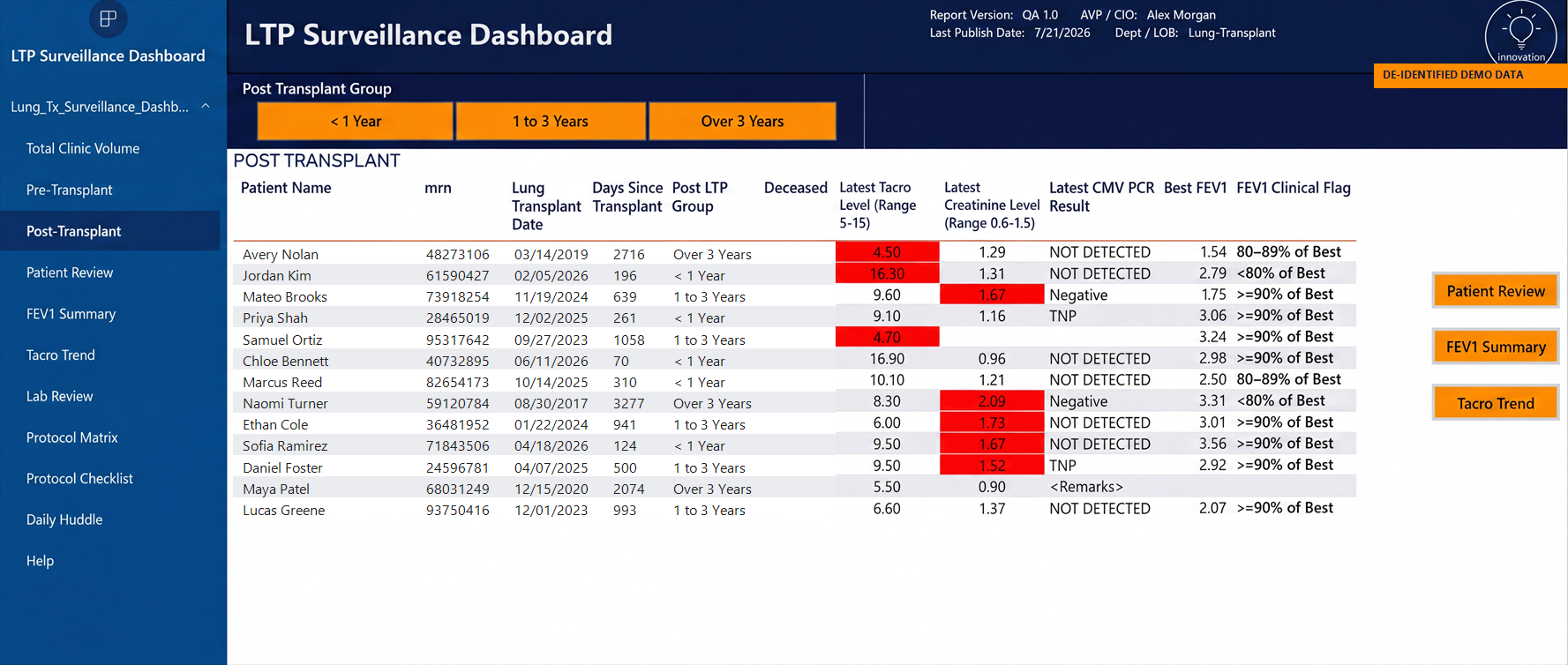
This public case-study image uses fictional names, fictional MRNs, altered transplant dates, and recalculated days-since-transplant values.
Conditional formatting makes exceptions visible immediately. In the configured dashboard logic, tacrolimus results outside the displayed 5–15 ng/mL range and creatinine results outside the displayed 0.6–1.5 range are highlighted in red.
The important design decision is that the team does not have to read every number with equal attention. The report directs attention to the rows that may require review while keeping the surrounding clinical context visible.
Showing Change Over Time
A latest value is useful, but a trend often tells the more important story.
The lab review page lets the team select a panel such as creatinine, albumin, hematocrit, hemoglobin A1c, potassium, BUN, glucose, hemoglobin, platelet count, or WBC. It then pairs the detailed result history with a longitudinal chart.
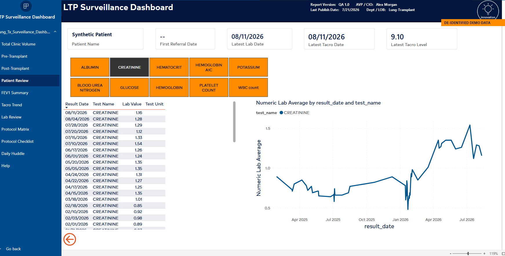
The lab review keeps the source values and the trend line together, reducing the need to move between separate screens.
Tacrolimus received a dedicated trend view. The report charts measured levels against the configured target minimum and maximum and calculates a "Tacro In Target %" KPI.
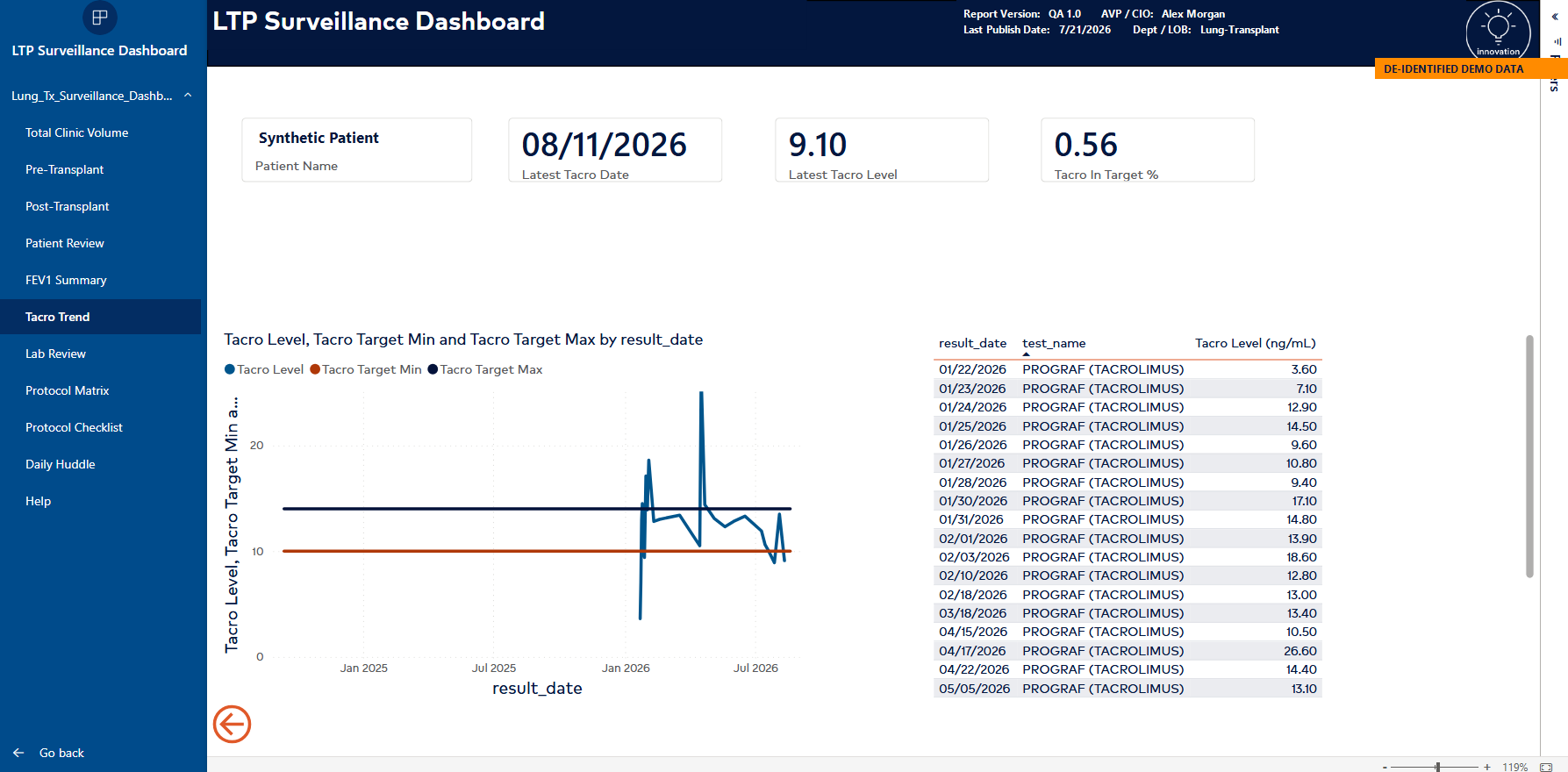
Target bands make excursions visible while the result table preserves the detail behind the chart.
The FEV1 logic uses each patient's own best result as the reference point. Patients are classified at 90% or more of their best, 80–89% of best, or below 80% of best. That converts raw spirometry into a patient-specific surveillance signal rather than relying on one universal threshold.
These ranges reflect the configured program logic shown in the dashboard and are presented here as a software case study, not as medical guidance.
Making the Protocol Executable
The most valuable part of the project was not a chart. It was turning the program's written post-transplant surveillance protocol into a queryable structure.
The Protocol Matrix organizes each procedure by post-transplant period and cadence, including quarterly, every three months, every six months, annual, and as-needed patterns. This gives the team a shared operational view of what should happen and when.
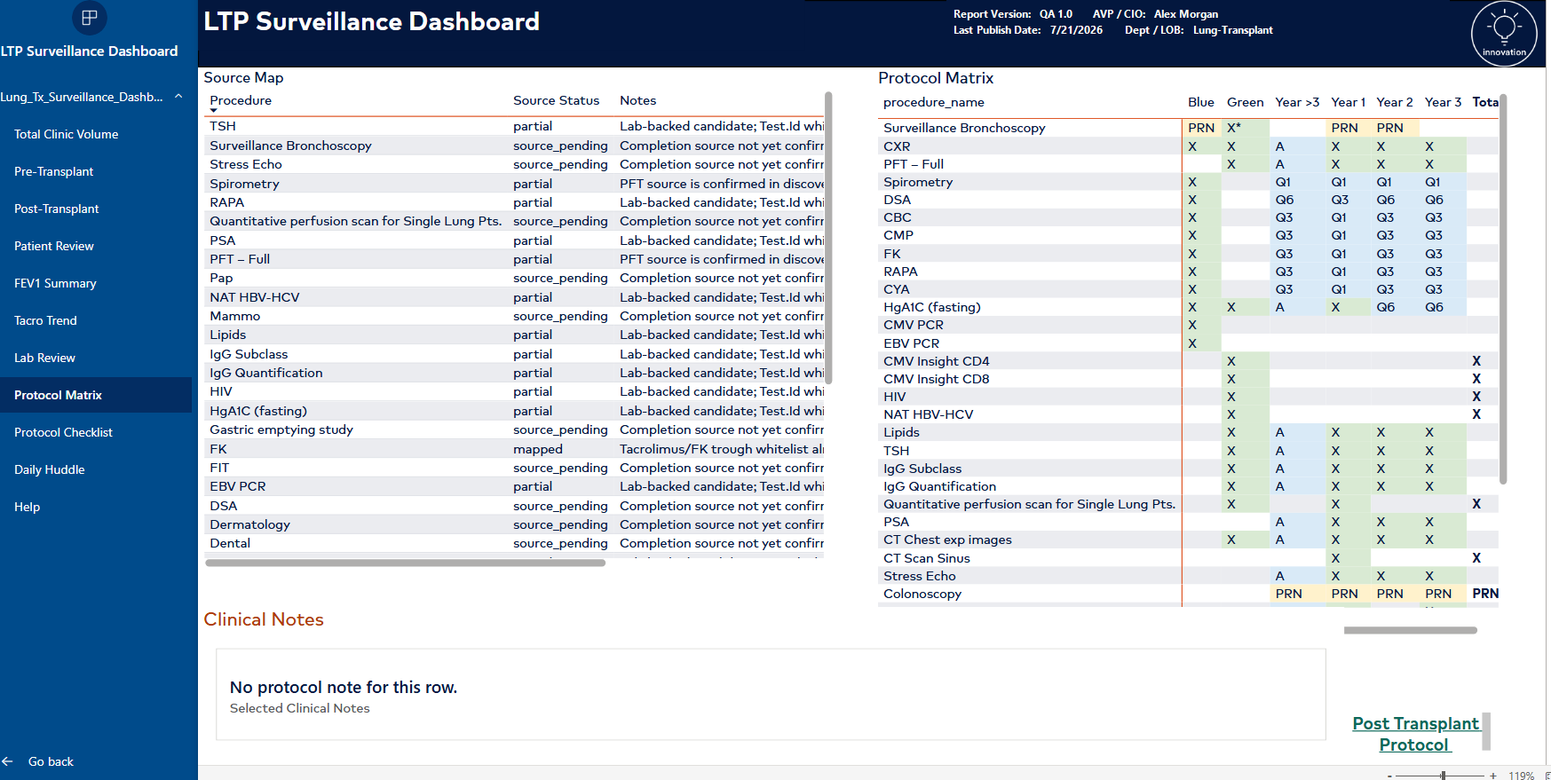
The source map sits beside the protocol matrix so users can see both the clinical requirement and the current data availability.
That transparency is essential in clinical analytics. A polished dashboard should never imply that a metric is complete when the underlying source is not. Showing the source status gives clinicians a reason to trust the data that is present and a clear view of what remains unresolved.
The protocol page also keeps contextual clinical notes with the selected procedure.
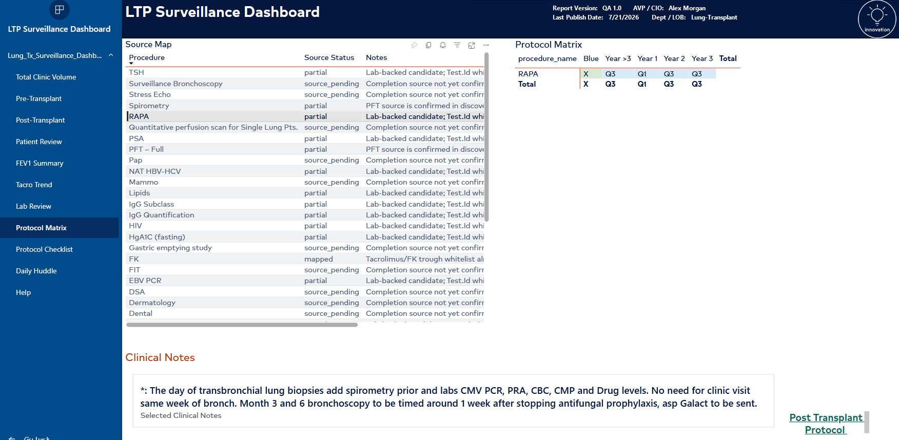
Clinical notes preserve the operational context that a cadence code alone cannot communicate.
Designing for the Daily Huddle
The report was built as an 11-page clinical surveillance application, not a static executive dashboard. Its pages include clinic volume, pre-transplant, post-transplant, patient review, FEV1 summary, tacrolimus trends, lab review, protocol views, and a dedicated daily huddle page.
The Pre-Transplant and Post-Transplant pages serve as the primary cohort entry points. From either page, clinicians can select a patient and drill down into three focused views:
- Patient Review for the selected patient's consolidated clinical information
- FEV1 Summary for patient-specific pulmonary function surveillance
- Tacro Trend for longitudinal tacrolimus results and target-range review
These drill-down pages let clinicians move from the cohort view into the selected patient's detail without leaving the dashboard or reconstructing the record across separate reports.
That last page matters because analytics only creates value when it fits the work. The dashboard had to support the team's recurring discussion: which patients need review, which alerts deserve follow-up, and which protocol requirements are approaching or incomplete.
Building around the huddle changed the design from "show everything" to "show what the team needs to decide next."
Privacy and Governance by Design
The solution was developed and operated inside a HIPAA-regulated enterprise environment under the health system's data governance. The architecture used governed source systems, controlled access, and a daily-refreshed Power BI report rather than exporting patient data into an ungoverned AI workflow.
For this public case study, the media received an additional privacy pass:
- Patient names and medical record numbers were replaced with fictional values.
- Transplant dates were altered and days-since-transplant values were recalculated.
- Patient names on trend views were replaced with a synthetic label.
- Browser URLs and personal browser chrome were cropped.
- The executive name shown in the dashboard was replaced with a fictional name.
- Patient-level screenshots are labeled as de-identified demo data.
The same principle applied during development and publication: use AI to accelerate engineering, but do not make patient data the price of that acceleration.
What This Project Demonstrates
This project required more than Power BI development. It combined:
- Clinical workflow discovery
- SQL Server schema analysis and data engineering
- HCA HIN data discovery and governed access through GCP and BigQuery
- Semantic modeling and Power BI development
- Patient-specific trend and alert logic
- Protocol modeling and source-lineage transparency
- Privacy-aware use of AI-assisted development tools
The operational result was a single governed surveillance view spanning the direct TeleResults database and HIN data queried through BigQuery. The team could review the post-transplant panel through exceptions, trends, and protocol status instead of reconstructing the same picture one chart at a time.
That is the kind of healthcare technology work Texas AI Consulting is built to do: connect clinical knowledge with engineering execution so the final system supports the people delivering care.
Related Reading
- From Flight Nurse to AI Engineer: Why I Started Texas AI Consulting
- How Texas Healthcare Companies Can Secure Funding to Upgrade Their Technology Systems
Texas AI Consulting | From the bedside to the data model — clinical technology built around the work.